Categories
Design GTD Lifehacks Software Technology Web Services

SlimTimer – The Best Timer for GTD

I’ve looked at several options for making sure I “use my time wisely” while I’m on the computer including:

None of them fit my criteria of being easy to use, easy to see where my time went (some type of reporting) and inexpensive. Then I went back to SlimTimer. The concept is simple. You open up a little window that sits on your desk all day (I open mine in Safari so tabs don’t accidentally pop up there from my default browser, Firefox) and click the name of the activity you’re doing at the time. That’s it. Here’s my window right now.
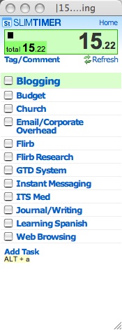
Screenshot 01

When you’re done you close the window, click another task or toggle the task you’re on. Then the cool part is the reports that are available on the main SlimTimer website. You can see where your time went specifically for the day, week month, per task, tag etc. Here’s a screen capture of a report:

Screenshot 02

SlimTimer is simple, powerful, quick and free. Can’t beat that.

Technorati Tags: , , , , , ,

Categories
Design Technology

The Merits of Bad Design

Ugly!
Robert Scoble wrote about the idea of bad design being better for business here, which got me thinking about the sites I visit frequently:

  • Bloglines – Definitely not a well designed site, but probably the best aggregator online.
  • tech.memeorandum – Recently re-designed, but still.. not a great looking site.
  • Google – Not poorly designed by any stretch, but minimalistic to say the least.
  • Tasktoy – Not as well known, but indispensable to me. This one won’t win any design awards anytime soon.
  • del.icio.us – Again, indispensable and not well designed at all.
  • Slashdot – Needs no introduction and I don’t think anyone’s going to try to defend the design.
  • Silverfish Longboarding – The most successful site I’ve personally created and let’s face it, it’s ugly! It’s always bothered me how ugly it is, yet it remains the most popular longboarding site online.
  • MacRumors – It’s a Mac site! The Mac site I visit the most is poorly designed! I also read ThinkSecret quite a bit, the design isn’t horrible, but it’s not slick either.

The only well designed sites I visit on a semi-regular basis are:

Other non-designed sites include almost every get rich website ever created (and there are a lot and people make money on them), eBay–it’s not exactly ugly, but it’s definitely not going to win any beauty contests any time soon, useit.com – the number one usability site, Craigslist (as Scoble mentioned) and many others.

Of course there are tons of well designed sites that are successful such as everything by 37Signals, Flickr, Technorati, YouTube (arguably) and a million other websites and blogs, but still, the point remans that the sites I visit most (and I’m a web designer) are almost all either under-designed or in some cases, flat out ugly.

What does it mean? I’m not completely sure, but I definitely think that a few conclusions can be drawn:

  1. Design isn’t the most important aspect of a site.
  2. Functionality beats design.
  3. There’s something to be said for the “homemade” look in terms of building trust.

I don’t, however, think that bad design makes a site good. I think that what keeps me coming back to all those poorly designed sites is the feeling that there are some extremely smart people behind them who maybe don’t have time to worry about the design. If they were better designed, I think that if anything, I’d be more likely to visit them.

Technorati Tags: , ,

Categories
Design Software Technology

Tumblelog

Projectionist

Here’s something to keep an eye on – Tumblelogs. Basically a blog with quick posts consisting of pictures, quotes, links and whatever else is on the mind of the author. Tumblelogging is bound to grow–as of today there are 540 Google results for “tumblelog.” I predict 10,000 within 6 months. I’m not sure of the origin of the word, but the best I can tell it was coined here. The best example (by far) is the gorgeous Projectionist website… a site that has forever changed the way I think about blogging. Amazing.

I can definitely see the need for a CMS that supports this style of blogging. Hopefully Lifecapsules will fill the need.

[UPDATE: That didn’t take long–10/12/2005 – 12,100 results from a search for Tumblelog]

Technorati Tags: , , ,

Categories
Business Design Knowledge

Paul Frank is Your Friend

Paulfrank
This is the first in what will hopefully be many similar posts to follow. I’ve been reading quite a bit lately on various topics–from business to programming to real estate. In order to retain the information better myself as well as pass it on, I plan on posting some of what I learn here. The posts will be in the category “knowledge” as well as in the other categories they might belong in.

Paul Frank – Paul Frank’s design business is worth $100 million. He started the business with $5000 borrowed from his friend Ryan’s stepmom in 1995. Paul Frank is 37 years old. Up until he was 31 he lived at home, but says he always felt successful anyway.

Paul Frank does not have a hard time getting licenses to use other companies logos. He says, as an example–“Any company can make a green t-shirt with a John Deere logo. Paul Frank makes a fine fashion bag that is printed gold inside with a John Deer logo in gold satin and on the outside is printed some of the very first John Deere vehicles. That’s not just a green t-shirt with a Deere logo on it. We look for companies or people that have integrity and class.”

Paul Frank does not pay for product placement.

Source – INC Magazine, August 2005 Page 88

Technorati Tags: ,

Categories
Design

Queenthings Redesign, CMSFactor Design

AweFinally got around to taking Jenny’s design and writing the code to make it work. All CSS on Queenthings.com. I’m happy about that. I’ve been a little behind the times in that realm, but I’m catching up now.

Cmsfactorlogo

I’ve also started a new site, CMSFactor.com. It’s a Drupal site, not much content there now, but much more to come, as well as the reasons *why* i started it soon.

Lots of webdesign going on around here. Lots of other stuff as well which I’ll post about when the time is right.

Categories
Design Software

193 Big Reasons and 5 Small Reasons Why Google is Better than MSN Search

Google VS MSNThis comparison has nothing to do with search results, but with the design of the site. The test was done in Firefox 1.0 on OS X, but the results are similar in any browser. Click to enlarge the image.

There are 193 pixels of ads and extraneous information before you get to what you’re looking for (search results) on MSN Search. MSN forces you to spend extra time either scrolling or filtering out garbage in an effort to display ads above search results. What Microsoft fails to see is that while they’re trying increase the chances of you clicking an ad to pay their bills, putting the ads where they get in the way of your goal only drives your business away from the site altogether, reducing the chances of you clicking the ads down to zero. Granted, Google sometimes places ads above search results as well, but their ads take up much less space and they don’t show up on every single search result.

The way Google separates the URL line from the results is much better than what MSN does. Google has a normal line break, then 21 pixels from one entry to the next. MSN has 12 pixels after the description then another 17 pixels after the URL line. This makes it significantly more difficult to quickly separate results. While MSN has a total of 29 pixels between results (5 pixels more than Google) , the whitespace on MSN is much more jagged and search results seem to jumble together at a quick glance.

Categories
Design Software

Save a Good Design for Later

One of the most helpful tricks I’ve learned as a web designer has been to save copies of good designs for future inspiration. I’ve found that the best way to do it is rather than bookmarking the site (only to find it’s been taken down or changed) I take a screenshot of it and make a folder in iPhoto (on the Mac) or Picasa or Adobe Albums (on the PC) and store it there for quick, easy access.

iPhoto Design Shots

Something that has helped keep me motivated is having good tools to quickly and effortlessly take screenshots. I use:

Paparazzi1. Paparazzi – This program lets you take screen captures of the entire webpage – whether or not it fits on the screen without scrolling. A very simple, useful, well done (free) tool.

Freesnapz

2. Freesnap – Another simple, functional (more general usage) screen capture program.

3. Shift + Command + 4 + Space – the OS X shortcut to take a screenshot of just a window.

4. MWSnap – A great, free windows screenshot utility.

Also, since I recently discovered Furl, I’m considering also using that service as a way to save actual HTML copies of sites in a centrally accessible location.

Categories
Design

CSS Woes

I’ve designed web pages for several years now. I’ve used cascading stylesheets to some extent with every site I’ve created, principally for text formatting. Over the past two weeks I’ve been working on a couple WordPress weblogs. By default WordPress comes with a file called index.php with div tags and styles already inserted. I’m trying, for the first time, to use only css to format the layout of the site and I have to admit, it’s driving me crazy!

Tables seem so much more intuitive to me. I guess it’s because I learned that way and change is hard, but give me a break… why is it so hard just to have all the content centered in the browser with css?

If anyone has a suggestion of a good book that will get me up to par without necessarily starting from the dead beginning of what CSS and HTML are, I’d appreciate it. I’m going to try to stick with this and get on the css bandwagon (late albeit) and do things right from now on.

Categories
Design

First Websites…

Remember when you created your first website? My brother-in-law who happens to be my wife’s twin just created his (with a little help and server space from me) here: benreedjohnson.com. I especially recommend the family page where I gained some valuable insight into the childhood of my wife… aside from relating to me personally, it’s funny. He’s also started a weblog tonight… should be interesting.